Eco-Stylist
Project Type: E-Commerce Website
Role: UI/UX Designer
Duration: 2 Weeks
Objective: Increase the retention rate
Discover
Eco-stylist, located in the vibrant heart of the city, plays a crucial role in its diverse neighborhoods. With a focus on personalized service and fair pricing, it caters to a wide range of clients, including local residents and small businesses. By hiring from the local community and supporting neighborhood initiatives, Eco-stylist prioritizes personal connections and offers a curated selection of high-quality products. Although they have their own website, many customers are disappointed with the results due to the limited time and expertise available to enhance the user experience. As a result, Eco-stylist struggles to effectively utilize its online presence.
About Eco-Stylist
As a UX designer dedicated to enhancing the Eco-stylist website, I quickly recognized the need for a deeper, user-centric understanding to address the underlying causes of user dissatisfaction. This realization guided me to a pivotal step in the design process: conducting comprehensive usability testing. Through this testing, I was able to identify three key issues that were significantly hindering the user experience on the website.
Usability Testing
The website currently allows users to filter only one brand at a time. We need to implement a new system that enables users to filter multiple brands simultaneously
01.Filtering Limitations
After asking users to filter items by price they were most likely to click on “values” instead of “price”. We need to be careful putting those two words next to each other to avoid users confusion
02.Website Language
Overall clarity and user satisfaction levels are below the average point. The current website has 2 points out of 5
03.Overall Clarity
Home Page
Product List Page
Product Page
Define
After conducting usability testing, I clearly defined the primary objective: to gain a comprehensive understanding of general behaviors and preferences related to clothing shopping websites. This involved examining how users interact with these sites, identifying key patterns in their shopping habits, and uncovering their preferences and pain points. Here are some main trends that come up during user interviews:
User Interview Takeaways
“I like to pair clothes”
“I prefer simple interface design”
“I like trending brands”
“I want detailed information about product”
Based on the interview data I've gathered, I created user persona to better understand and address real user goals, challenges, and behaviors. Personas help me build empathy by considering the user’s perspective, which can lead to more thoughtful and effective design solutions.
User Persona
I created this journey map to visualize George's experience buying a shirt on an Eco-Stylist website. It outlines his actions, emotions, and pain points throughout the process.
Retrospective Journey Map
George needs detailed information about the style and fit, so that he can make informed decisions about his purchases, ensuring the clothes align with his personal style and body shape
Problem Statement
After conducting closed card sorting activity with three users, this is how I outlined website’s navigation
Information Architecture
Design
I’ve completely redesigned the homepage to ensure a clean and consistent layout, prioritizing product visibility over company information. The design now highlights a broader selection of products, aligning with our users primary goal finding the right items quickly and efficiently.
Home Page Redesign
To streamline the search process, I’ve introduced multiple filtering options. The new checkbox system allows users to select multiple brand simultaneously, making the journey to find the desired product faster and more intuitive.
Enhanced Filtering System
The product page has been reimagined to provide comprehensive and useful information. Key additions include detailed product descriptions, information about materials, a "how to style" section for outfit inspiration, and a size guide chart. These features are designed to help users make informed purchasing decisions, bridging the gap between expectations and reality.
Product Page Improvements
Deliver
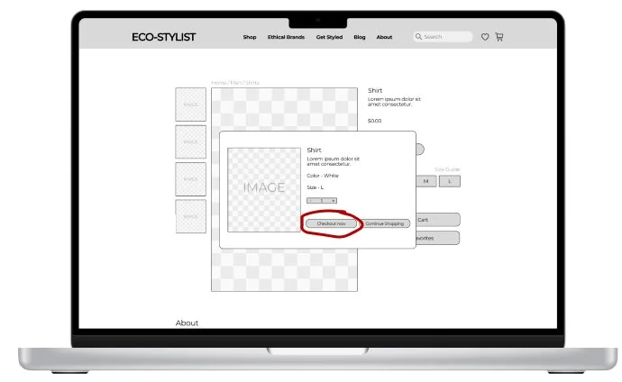
After completing the wireframes and prototype, I reached out for feedback to ensure my design solutions effectively addressed users' goals and pain points. During the second round of usability testing, the only issue that surfaced was in the checkout phase. Users mistakenly clicked the "continue shopping" button instead of "checkout now," thinking it would complete their purchase. To resolve this, I reconsidered the website's language and replaced "continue shopping" with "buy now," highlighting the button to make it more prominent and intuitive.
Usability Testing Round 2
Before
After
Final Prototype
Summary
In this project, I redesigned Eco-stylist's e-commerce website to create a more intuitive and enjoyable user experience. Through user research, competitor analysis, and usability testing, I identified key areas for improvement and developed solutions that align with users' needs and expectations. The final design enhances navigation, product visibility, and overall user satisfaction, supporting Eco-stylist's goals of better connecting with customers and driving sales.
Learnings & Next Steps
This project taught me the importance of user-centered design and the impact of small details on the overall experience. If I had more time, I would focus on optimizing the mobile experience and exploring opportunities to introduce personalized features that could further enhance user engagement and satisfaction.


