Pearl
Project Type: E-Commerce Website
Role: UX Designer, UI Lead
Timeline: 2 Weeks
Objective: Streamline the portfolio creation process and increase retention rate
The Pearl platform gives jobseekers with non-traditional backgrounds a competitive edge in the job search. The platform improves their odds of getting hired through in-app portfolio builders, quantitative and qualitative feedback mechanisms, and digital career fairs.
About Pearl
Our primary mission was to drive sustained user engagement on Pearl by facilitating a smoother, more intuitive process for users to create and share portfolios after their initial sign-up. We recognized that a streamlined portfolio creation journey could transform passive users into active contributors who showcase their skills and personal brands confidently. By focusing our efforts on job seekers, especially those from non-traditional backgrounds, we aimed to make Pearl a go-to platform for anyone looking to share their work and professional identity in a more manageable way.
Mission
Discover
Pearl's user base includes diverse audiences, but this design sprint focused on non-traditional job seekers, individuals not currently in the tech field or without formal technical backgrounds. To understand their unique needs and challenges, we conducted a screener survey with 58 participants. This quantitative analysis gave us a clear view of their portfolio-building experiences:
Survey Insights
These results indicated a strong need for a user-friendly, guided experience that simplifies the portfolio-building process. Armed with these insights, we conducted a heuristic analysis to pinpoint existing usability issues and discover areas where our platform could simplify and clarify the user journey.
Heuristic Evaluation
01.Overwhelming Entry Points
Pearl offered four different ways to initiate a portfolio, creating unnecessary complexity and potentially overwhelming first-time users. Each entry route led to different screens, causing inconsistencies in navigation and design. This inconsistency went against the design principle of simplicity and created cognitive friction.
02.Inflexible Draft Management
With no option to delete accidental drafts, users were forced to manage cluttered and sometimes confusing portfolio spaces. The inability to organize or remove unwanted items left users feeling out of control and frustrated, especially those new to the platform who might make mistakes or change their minds. This lack of flexibility hindered effective portfolio management and added stress to what should be a simple, organized process.
03.Multiple Home Pages
Users expressed significant confusion when attempting to navigate the platform. They were unsure which “home” page they were on or how to return to the main landing page. This inconsistency diverged from typical web design patterns, breaking user expectations and further complicating navigation.
User Interview Takeaways
After completing heuristics we turned our attention to gathering insights directly from users, particularly those who either hadn’t yet built a portfolio or had attempted one but struggled to finish. We wanted to understand their unique challenges and experiences in more depth, aiming to design a solution that would truly meet their needs. Through around nine interviews, we identified several key patterns. These insights highlighted common barriers, motivations, and user expectations, giving us a clearer picture of what would make a portfolio-building tool more intuitive and effective for those who are just getting started or who have faced obstacles along the way. Here’s a summary of the main themes that emerged:
“I feel frustrated if I have to spend a lot of time on it”
“I want to connect with other people”
“I want customizable website that allow me to express my personal style”
“I value price and features”
Define
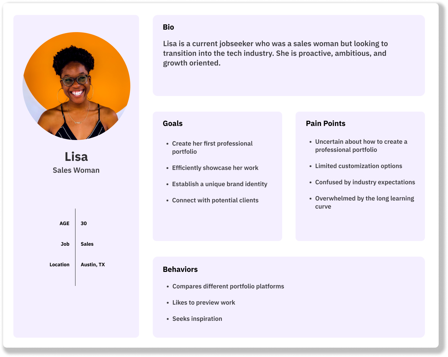
With all the insights gathered, we gained a solid picture of our user's goals, challenges, and behaviors. This persona became the foundation of each design choice, helping us craft features that matched real-life habits and preferences. It served as a constant reminder that we were designing for a real individual and kept our team committed to delivering an experience that felt authentic and meaningful.
User Persona
Lisa feels overwhelmed creating a professional portfolio. She needs clear guidelines and steps to build a standout portfolio showcasing her skills.
Problem Statement
HMW Statement
How might we simplify the process and provide enough flexibility for Lisa to create a portfolio?
Design
Lo-fi Wireframes
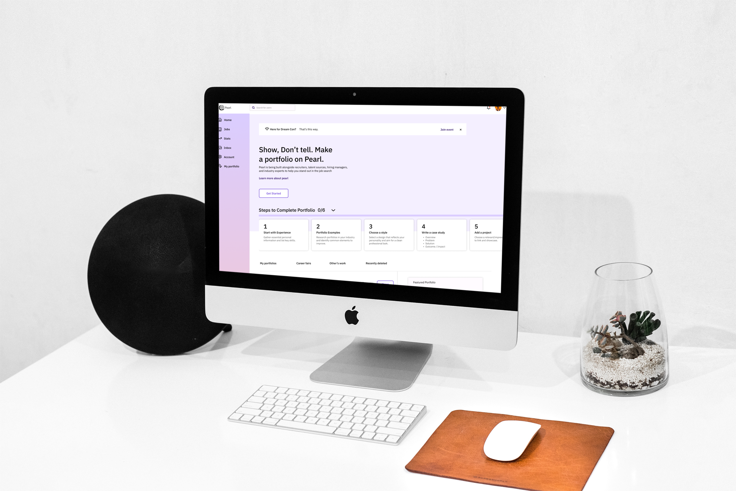
Our redesigned home screen mirrors the original Pearl website but with a key improvement: the cards now represent the steps needed to complete a first portfolio, creating a mission-based journey similar to a video game. This step-by-step approach is crucial for first-time users, making the process more manageable and rewarding. Additionally, we’ve added a “get started” CTA to encourage users to take action and create their first portfolio.
Step 1 – Getting Started with Basic Information
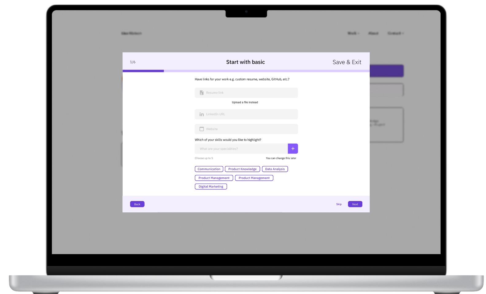
The journey begins with a single, inviting “Get Started” button. Clicking this button launches an onboarding flow where users enter foundational information, including work experience, skills, resume, and LinkedIn profile link. This step allows them to feel grounded in their accomplishments, as they’re able to focus on sharing information they’re already familiar with, setting them up for success from the very start.
After entering their information, users can explore portfolio examples to gain inspiration and a clear vision of what they’re working toward. This step addresses the frequent user need for reassurance, helping first-time creators visualize the outcome of their efforts. To make this feature more intuitive, we used a modal overlay that keeps users anchored in the flow while offering inspiring examples at a glance.
Step 2 – Portfolio Examples
Step 3 – Style Customization for Personal Branding
Users then proceed to select a style for their portfolio, choosing between light or dark modes and selecting an accent color to match their personality and brand. This balance of simplicity and customization offers a low-effort way to personalize the portfolio, with live previews showing updates in real-time. This feature provides immediate feedback and boosts user confidence as they see their portfolio take shape visually.
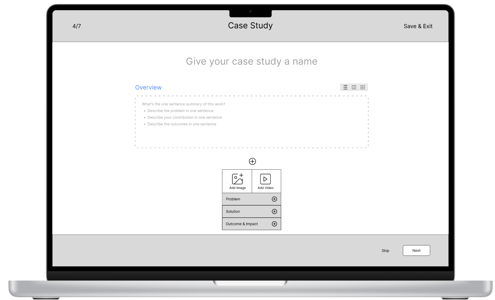
Finally, users begin crafting their first case study. Each section of the case study is broken down into clear steps, with prompts that guide users on what to include. Users can upload header images, provide a name for the case study, add supporting information, and embed files from Figma, Excel, and other tools. This modular approach makes creating case studies feel less overwhelming, while flexible features still allow customization for those who wish to include more details.
Step 4 – Guided Case Study Creation
Deliver
To validate our design, we conducted usability tests with targeted tasks to see if we’d achieved a simpler, more flexible process. We mainly focused on 3 tasks:
Usability Testing and Key Findings
1. Show us how would you start creating a portfolio
2. Try to customize the look and a feel of your portfolio
3. Start creating a case study
Our initial design allowed users to select up to five skills, but participants struggled with adding more due to a lack of prompts. In response, we added skill recommendations based on uploaded resumes, creating a more intuitive experience and helping users feel supported throughout the process.
Finding 1 – Adding Skills Easily
Before
After
The portfolio examples initially caused confusion, as users didn’t realize they were browsing samples. To improve clarity, we implemented a modal overlay for the examples, as well as for all other steps making them distinct yet accessible within the flow of the user’s portfolio page.
Finding 2 – Clarifying Portfolio Examples
Before
After
The mode and accent color options were hard to find and interact with due to small, out-of-the-way buttons. We improved this by redesigning the customization area, making it more prominent and allowing users to see live updates on their portfolio, instilling confidence and excitement in their final design choices.
Finding 3 – Enhanced Style Customization
Before
After
Final Prototype
Throughout this project, we identified additional opportunities to enhance user engagement and retention.
Next Steps and Recommendations
Unifying the homepage structure and using the Pearl logo as a home button across the entire site would reinforce predictable navigation and make site structure more intuitive.
1.Home Page Consistency
Integrating a community feature, inspired by platforms like Behance, would foster peer learning and inspiration. New users often look to others’ work for guidance, and a built-in community could help job seekers feel more supported.
2.Community Building
Many participants were unclear on terms like “case study” and “portfolio,” which could impact their understanding of the platform. Conducting further user interviews and surveys would help us clarify these terms and improve the user journey from the ground up.
3.Clarification of Key Terms
Our design made meaningful by aligning seamlessly with both user needs and client goals, resulting in a successful implementation on Pearl.us.com. By focusing on user-centered features, we ensured that the design addressed key pain points, creating an intuitive experience that met user expectations. At the same time, we remained aligned with a client’s vision, delivering a polished and functional design that enhanced the site’s overall value. This dual focus on user satisfaction and client objectives contributed to a solution that was not only well-received but also effectively implemented into Pearl’s live website.
Impact and Outcome
In this initial two-week client project, I learned some valuable lessons that shaped my approach to client work and collaboration. First, the importance of clear, consistent communication becomes evident early on. By setting up regular check-ins and updates, we kept a client informed and aligned with each step of our process, which helped build trust and prevented misunderstandings.
Another key takeaway was the need for flexibility and adaptability. Working within a tight timeline required us to prioritize efficiently, focusing on high-impact deliverables while being open to adjustments. This taught me to remain responsive, especially when handling unexpected changes or client requests.
Finally, we saw firsthand the value of a strong kickoff. Starting with clear goals and an understanding of the client’s vision helped us navigate the project with a shared focus making the most of our two-week timeframe. This experience emphasized the importance of aligning early to create a foundation that guides decisions throughout the project.
